Architecting an AG-UI Frontend in React: Event-Driven Widgets, Design Tokens & Ollama
On this page
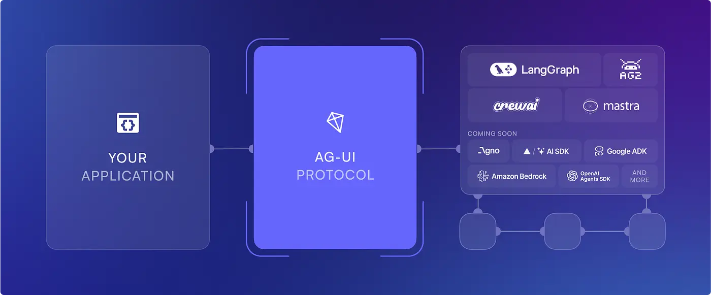
Every week, another AI chatbot appears on GitHub. Most of them look impressive during a demo. Ask a question. Receive Markdown. Render Markdown. Done.
Unfortunately, that's where many AI applications stop evolving. The moment an assistant needs to show a customer table, a dashboard, a calendar, a chart, or an interactive form, the illusion breaks. Suddenly you're no longer building a chatbot — you're building an application, and Markdown is the worst possible output format for one.
After experimenting with several approaches, I realised I had been solving the wrong problem. Instead of teaching an LLM how to generate UI, I should teach it how to choose actions. The frontend already knows how to render beautiful interfaces. The backend already knows where the data lives. The AI should only decide what needs to happen next.
That single architectural decision changed everything about how I designed my assistant. Today it renders sixteen production-ready React widgets, supports backend-driven UI, runs against a local LLM, added zero new frontend dependencies, and can be extended by registering one component.
TL;DR — Don't ask the model for HTML or JSX. Have the backend return an ordered
stream of typed events (text, tool, widget). The
frontend owns a registry of widgets and renders those events deterministically. The model's only
job is picking which backend capability answers the question. You get reliability, a reusable
component library, and a rendering pipeline that never changes as the widget count grows.
The Problem With AI-Generated UI
Most AI applications follow this pattern:
User
  ↓
LLM
  ↓
Markdown
  ↓
React renders Markdown
It's simple. It's also incredibly limiting. Sooner or later, users ask things like:
- "Show me all active members."
- "Compare monthly revenue."
- "Display upcoming appointments."
- "Open John's profile."
None of those answers are paragraphs. They're interfaces.
The common workaround is to ask the model to emit HTML or JSX. That sounds clever right up until the model hallucinates a component that doesn't exist, forgets a required prop, or invents an entirely new widget name. Now your frontend crashes because the AI imagined a component.
The frontend should never depend on the imagination of an LLM. There is a deeper problem too: generated markup can't be typed, can't be unit tested, can't be reused outside the chat, and can't be reviewed in a pull request. You lose every guarantee your component library was built to give you. I wanted something deterministic instead.
The Core Idea: the Model Chooses Actions, Not Components
The backend never returns HTML. It never returns JSX. It doesn't even return React component names. Every response is simply an ordered stream of events:
{
  "events": [
    { "type": "tool",   "tool": "list_members", "status": "completed" },
    { "type": "widget", "widget": "table", "props": { "rows": [] } },
    { "type": "text",   "text": "I found 24 active members." }
  ]
}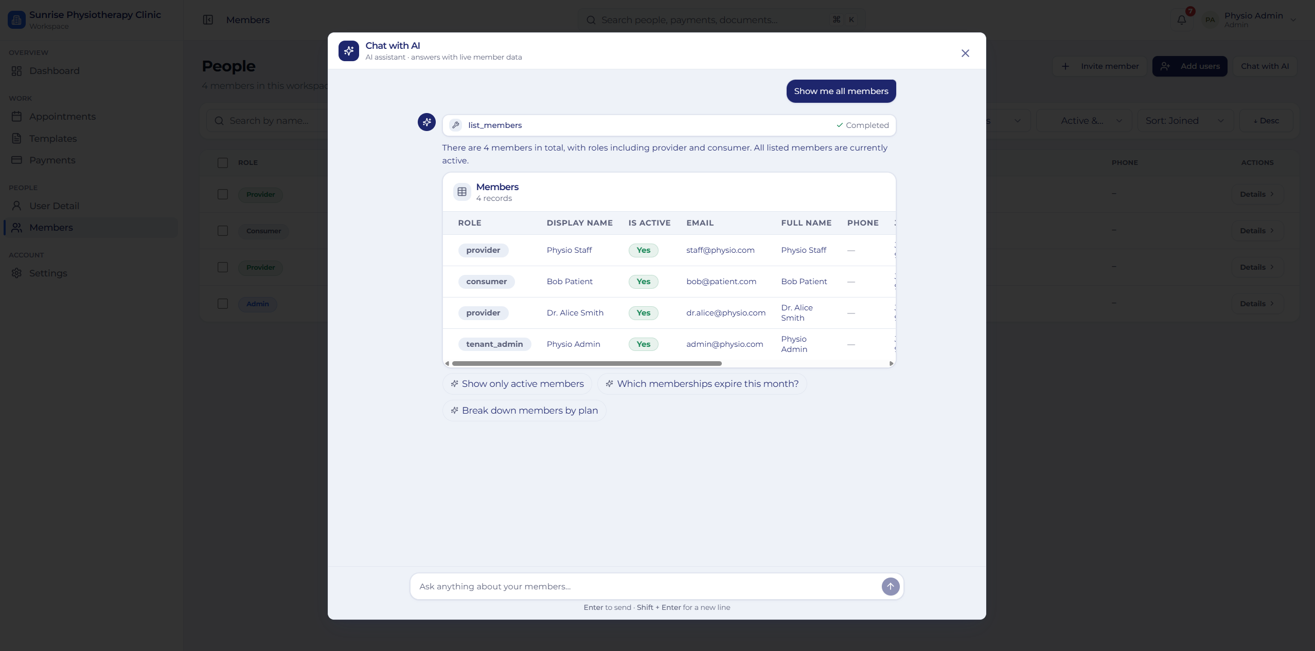
tool becomes the list_members ·
Completed chip, text becomes the one-line summary, and widget
becomes a real table component — not Markdown, and not markup the model wrote.That's it. The backend communicates intent. The frontend decides how that intent should be rendered. Responsibilities separate cleanly:
- AI decides what
- React decides how
- Widgets decide how they look
Nothing is coupled together. Note the subtle but important detail: "widget": "table"
is not a React component name. It's a semantic key in a contract. The frontend is free to render
table as a virtualised data grid on desktop and a stacked card list on mobile, and the
backend never needs to know.
The Event Protocol
The contract is small enough to fit in your head, which is exactly why it works. Typing it properly is what makes the whole thing safe:
type TextEvent = {
  type: 'text';
  text: string;
};

type ToolEvent = {
  type: 'tool';
  tool: string;
  status: 'running' | 'completed' | 'failed';
  error?: string;
};

type WidgetEvent = {
  type: 'widget';
  widget: WidgetName;              // union of registered keys
  props: Record<string, unknown>;  // validated at the boundary
};

export type AssistantEvent = TextEvent | ToolEvent | WidgetEvent;
Three event types cover every response the assistant has ever needed to produce. Ordering matters: events render in array order, so a tool card can appear before the widget it produced, and the summary sentence can land after it. The conversation reads like a narrated workflow rather than a wall of output.
One Rendering Pipeline, No Switch Statements
Every message flows through exactly the same path:
AiDialog
   ↓
ChatMessages
   ↓
ChatMessage
   ↓
MessagePart
   ↓
WidgetRenderer
   ↓
widgetRegistry[widget]
There are no switch statements scattered across the application. Everything funnels through one renderer, and every event type has exactly one responsibility. Text events become chat messages. Tool events become progress indicators. Widget events become React components.
The property I care about most: adding functionality doesn't change the pipeline. It adds a widget. The renderer I wrote for widget number one is the renderer running for widget number sixteen — untouched.
Open for Extension, Closed for Modification
I didn't want developers editing rendering code every time they built another widget. So every widget is registered exactly once:
export const widgetRegistry = {
  table,
  profile,
  chart,
  timeline,
  calendar,
  markdown,
  json,
  stats,
  progress,
  alert,
  fileList,
} satisfies Record<string, ComponentType<any>>;

export type WidgetName = keyof typeof widgetRegistry;
That's the entire registration. Adding another widget is one line — no renderer changes, no
pipeline edits, no conditional rendering. And because WidgetName is derived from the
registry with keyof typeof, the type system stays in sync automatically. A widget key
that isn't registered is a compile error, not a runtime crash.
This is the open/closed principle doing real work:
Extend by registration, never by editing.
It keeps the rendering engine stable while the widget library grows indefinitely. It's the same instinct behind building a design system instead of a component per screen — one canonical implementation, selected by data.
Never Trust the Model: Validate Props at the Boundary
Here's the part most "generative UI" tutorials skip. Even when the model only picks tools, the
props reaching your widgets came from somewhere upstream — a tool result, a database row, a
model-shaped payload. If a widget assumes props.rows is an array and it arrives as
null, the whole conversation white-screens.
So the registry stores a schema alongside the component, and WidgetRenderer
validates before rendering:
const registry = {
  table: {
    schema: z.object({
      columns: z.array(z.object({ key: z.string(), label: z.string() })),
      rows: z.array(z.record(z.unknown())).default([]),
    }),
    component: TableWidget,
  },
  // ...
};

function WidgetRenderer({ widget, props }: WidgetEvent) {
  const entry = registry[widget];
  if (!entry) return <UnknownWidget name={widget} />;

  const parsed = entry.schema.safeParse(props);
  if (!parsed.success) return <WidgetError name={widget} issues={parsed.error.issues} />;

  const Widget = entry.component;
  return <Widget {...parsed.data} />;
}
Two failures, two graceful outcomes. An unregistered widget name renders a small "unsupported content" notice instead of throwing. Malformed props render a compact error card — visible in development, quiet in production — instead of taking down the message list. A single bad tool response degrades one bubble, never the conversation.
Wrap the renderer in an error boundary too. Validation catches shape errors; an error boundary catches everything else a third-party-ish component can do.
Building a Real Widget Library
Instead of returning Markdown, the assistant renders actual interfaces. The current library contains sixteen production-ready widgets:
- Table
- Card List
- Profile
- KPI Dashboard
- Charts
- Timeline
- Calendar
- Markdown
- JSON Viewer
- Alerts
- Progress
- File Lists
- Tool Status
- Legacy Member Table
- Legacy Member Card
- Statistics
Every widget follows the same rules:
- Strongly typed props
- Responsive layouts
- Semantic design tokens
- Dark mode support
- Self-contained implementation
- Zero shared state
That last constraint is the one that pays off later. Because no widget reads global state, every one of them is renderable outside the chat — in a report page, an email preview, a Storybook story, a snapshot test. The result is a reusable component library that happens to be driven by AI, rather than a pile of AI demos.
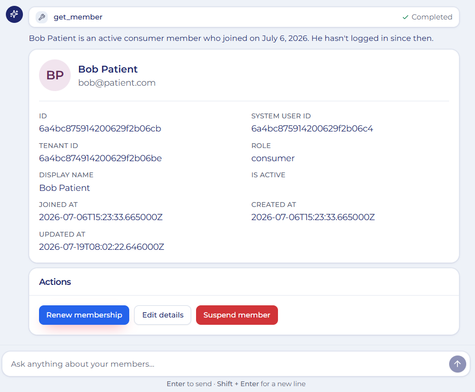
get_member tool returns a single
record, so the frontend picks the profile widget — typed field grid, semantic tokens, and an
actions row the widget renders but does not handle.Why I Added Zero Dependencies
One design goal stayed constant: don't increase bundle size. Reaching for a library per widget — a chart lib, a calendar lib, a JSON viewer, a Markdown renderer — is the fastest way to a heavy application and sixteen different styling languages fighting each other.
So everything is built on the existing stack:
- Charts are pure SVG
- Markdown goes through a safe parser, never
dangerouslySetInnerHTML - The JSON viewer is handwritten
- Everything is styled with semantic design tokens
The whole frontend is React 18, TypeScript, Tailwind CSS v4, and shadcn/ui. Nothing else. Beyond bundle size, this bought something less obvious: visual coherence. A charting library brings its own color scale, its own dark mode story, its own font sizing. Sixteen widgets built on one token layer look like one product. That coherence is very hard to retrofit.
Interactive Widgets Without React Callbacks
Interactive widgets introduced a real problem. The backend sends JSON, and JSON cannot contain JavaScript functions. So how does a button inside a widget talk to React?
Instead of threading callbacks through props, every interactive widget emits a browser
CustomEvent:
// Inside a widget — it knows nothing about the app
element.dispatchEvent(
  new CustomEvent('ai:action', {
    bubbles: true,
    detail: { action: 'open_member', payload: { id: member.id } },
  })
);
Widget
↓
CustomEvent
↓
AiDialog
↓
AI AgentThe widget simply announces that something happened. The host listens. The host decides what to do — send a follow-up message to the agent, navigate, open a drawer. That keeps widgets completely reusable: they can be embedded anywhere without depending on application state.
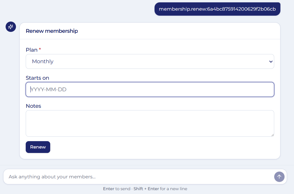
ai:action; the host turns it into the next turn
(membership.renew:<id>) and the agent answers with a form widget. No callback
ever crossed the JSON boundary.One practical caveat worth knowing: use bubbles: true and listen on the dialog
container, not window. Two open assistants (or a widget rendered in a side panel)
would otherwise cross-talk. Scoping the listener to the container keeps each conversation isolated.
The AI Doesn't Decide the UI
One of the biggest architectural mistakes I see is asking the LLM to choose UI components. Large language models are excellent at reasoning. They are not deterministic UI engines.
So instead of asking the model "which React component should render this?", I ask it something much simpler: "which backend tool should answer the user's question?"
The frontend already understands tables. It already understands charts. It already understands profile cards. The AI only chooses which business capability should execute — and the mapping from capability to widget is code I wrote, reviewed, and tested. The rendering stays deterministic, and reliability improves dramatically.
| AI generates the UI | AI picks a tool (backend-driven UI) | |
|---|---|---|
| Failure mode | Hallucinated component crashes the app | Unknown tool → graceful fallback message |
| Type safety | None — markup is a string | Full — props validated against a schema |
| Testing | Non-deterministic output, hard to assert | Widgets unit tested like any component |
| Design consistency | Model invents spacing and colors | Design tokens, every time |
| Security | Injected markup is an attack surface | No markup crosses the wire |
| Token cost | Pays to re-emit layout on every reply | Emits a short event list |
Replacing Hardcoded Endpoints With a Tool Catalog
Originally the assistant knew exactly one API endpoint. That obviously couldn't scale. Now every request carries a catalogue of the capabilities available on that particular page:
{
  "message": "Show me all active members",
  "tools": [
    { "name": "list_members", "endpoint": "/api/v1/members",        "method": "GET" },
    { "name": "get_member",   "endpoint": "/api/v1/members/{id}",   "method": "GET" },
    { "name": "member_stats", "endpoint": "/api/v1/members/stats",  "method": "GET" }
  ]
}
The frontend decides which capabilities exist. Different pages expose different tools. The AI adapts automatically — no backend redeployment, no prompt modifications. The contract becomes remarkably flexible, and the assistant on the billing page stops being tempted by member queries it has no business running.
The one thing you must not get wrong: a client-supplied tool catalogue is a
hint, never an authorization. The backend must independently verify that the current user
may call the tool it just received, exactly as it would for a direct API call. Treat the catalogue
as untrusted input — allowlist tool names server-side, and never let a client-supplied
endpoint string become the URL your server actually fetches. That's how a convenience
feature turns into server-side request forgery.
This shape will look familiar if you've read about the Model Context Protocol. The idea is the same: describe capabilities as data, let the model select among them, keep execution on the trusted side of the boundary.
Streaming Without Breaking the Contract
A response that takes eight seconds to appear feels broken, no matter how good the widget is. The event protocol handles this without changing shape: the backend streams events as they resolve, and the frontend appends them.
The trick is that a tool event is emitted twice — once as running, once as
completed — and the frontend reconciles by tool name. The user sees "Fetching
members…" turn into a checkmark, then the table drops in beneath it. Same three event types, no
special-case streaming code, and every intermediate state is a real render rather than a spinner
hiding an unknown.
One detail that matters more than it should: auto-scroll must be scoped to the message container, not the page. Widgets change height as data arrives, and a page-level scroll handler will fight the user every time a chart finishes laying out.
Building a Chat Experience That Feels Modern
A widget framework isn't enough — the conversation itself has to feel natural. The interface now behaves much closer to ChatGPT or Claude than a traditional enterprise chatbot:
- Full-screen chat dialog
- Right-aligned user messages
- Bubble-less assistant layout
- Container-scoped auto-scroll
- Auto-growing message composer
- Suggestion chips
- Animated typing indicator
- Tool execution cards
- Compact 13px information density
Dropping message bubbles for assistant replies was the highest-leverage visual decision. Bubbles cap your content width by design, which is fine for sentences and hostile to tables. Without them, a dashboard or a twelve-column table can use the full conversation width naturally.
During development I also hit a subtle production bug worth repeating: WidgetRenderer
was exported as a default export but imported as a named one. Everything worked
perfectly until the first widget event appeared — at which point every widget in production would
have crashed. Text-only conversations never touched that code path. It's a good reminder that in an
event-driven system, your test conversations must exercise every event type, not just the
common one.
Feature Flags Matter
Rolling AI out to production shouldn't require deployment branches. The entire assistant sits behind a single flag:
VITE_ENABLE_AI_CHATOne switch controls the chat entry button, the dialog, routing, rendering — the whole experience. That makes gradual rollout and A/B testing trivial, and it makes the rollback plan a config change rather than a revert.
Testing a Widget Framework
Because rendering is deterministic, testing splits into three cheap layers instead of one impossible one:
- Widgets are plain components. Give them props, assert the DOM. No AI involved.
- The renderer is tested with fixture event arrays — including a deliberately unknown widget name and deliberately malformed props, to prove both fallbacks hold.
- The agent is evaluated separately on one question only: given this prompt and this tool catalogue, did it pick the right tool? That's an assertion about a string, which is far more tractable than asserting about generated markup.
Splitting the non-deterministic part into its own thin layer is the real testing win here. Only the tool choice is fuzzy. Everything downstream is ordinary software.
When This Architecture Is Overkill
I'd be lying if I said this is the right call for every project. It isn't.
If your assistant genuinely only answers questions in prose — a docs search bot, a writing assistant — Markdown is the correct output and a widget registry is ceremony you don't need. The cost of this approach is real: you must design and maintain the event contract, keep the widget library coherent, and version the protocol once external consumers depend on it.
The moment it pays for itself is the moment a stakeholder asks for a table. If your assistant sits on top of structured business data, you'll get there in week two, and it's much cheaper to start here than to retrofit it after a Markdown-shaped codebase has hardened around you.
Design Principles That Guided Every Decision
- The backend decides what.
- React decides how.
- Widgets decide how they look.
- Extend through registration.
- Communicate through events.
- Build on existing foundations instead of adding dependencies.
Those six principles influenced almost every architectural decision, and they're the part of this write-up that transfers to a stack that looks nothing like mine.
The Result
The finished system isn't simply another chatbot. It's an application framework driven by AI. The assistant can now:
- Render sixteen production-ready widgets
- Display structured business data instead of paragraphs
- Support dark mode automatically
- Add new widgets with one registry entry
- Keep widgets completely decoupled
- Render tables, charts, calendars, timelines and dashboards
- Adapt per page through a dynamic tool catalogue
- Remain dependency-free beyond the existing frontend stack
Most importantly, the architecture scales in the direction it will actually be pushed. Adding widget number seventeen won't require rewriting the renderer. Neither will widget number fifty. Only the registry grows.
Final Thoughts
One lesson stood out more than any other during this project.
The future of AI interfaces isn't AI-generated HTML. It's backend-driven UI.
The model shouldn't generate JSX. It shouldn't invent component names. It shouldn't design layouts. It should understand user intent, choose the correct business capability, and let the frontend render deterministic, reusable interfaces.
Once I embraced that, everything got dramatically simpler. The rendering pipeline became stable. The widget library became reusable. The AI became more reliable. And the frontend stopped behaving like a chatbot — it started behaving like a real application.
That, in my opinion, is where AI-powered user interfaces are heading.
Key Takeaways
- Ask the LLM to choose actions, not components. Reasoning is what models are good at; deterministic rendering is what your frontend is good at.
- Ship a small event protocol (
text,tool,widget) instead of markup. Three types covered every case I hit. - Extend by registration, never by editing — derive the widget-name union from the registry so the type system stays honest.
- Validate props at the boundary and give unknown widgets a graceful fallback. One bad tool response should degrade a bubble, not the conversation.
- Use CustomEvents for interactivity so widgets stay portable and free of application state.
- A client-supplied tool catalogue is a hint, never an authorization — enforce permissions server-side.
- Add zero dependencies where you can: one token layer is what makes sixteen widgets look like one product.
Related Reading
- No Design System: The Silent Frontend Problem Slowing Every Startup — the token layer that makes a widget library coherent.
- React 19 Patterns That Replaced My Old React Habits — the component patterns underneath these widgets.
- Why Your Angular Project Needs a Signal Store — the same "logic out of components" instinct, on the state layer.
References
- Model Context Protocol — describing tool catalogues as data
- Anthropic: Tool use overview — how models select capabilities
- MDN: CustomEvent — decoupled widget-to-host communication
- Zod — runtime schema validation at the render boundary
- OWASP Top 10 for LLM Applications — why generated markup and client-supplied tools need guarding
- shadcn/ui — the component foundation the widget library is built on
I'm Sujit Yadav, a senior frontend developer working across Angular, React, and Next.js — see the work I've shipped or get in touch about a project.
Originally published on LinkedIn — read the original article.