No Design System: The Silent Frontend Problem Slowing Every Startup
On this page
Every startup I've worked with began the same way. A founder had an idea, the developers moved fast, the designs changed daily, and features mattered far more than consistency.
For the first few months, that's exactly the right call. Shipping quickly beats a perfect UI when you're still proving the product should exist at all.
Then six months pass. A year passes. And the frontend quietly turns into the slowest part of the company. Every new feature takes longer than the last. Bugs multiply. Designers get frustrated. Developers spend more time fixing UI inconsistencies than building anything new.
I've watched this happen enough times to know the root cause is almost always the same: there was never a design system.
TL;DR — The absence of a design system doesn't hurt on day one. It compounds. This post walks through how the decay starts, why the framework (React, Angular, Next.js, Tailwind) is never the real problem, and how I built a small, reusable design system that fixed it — using a shadcn-style component library with semantic design tokens in an Nx monorepo.
The Early Startup Mindset
In the early stage, the priorities are blunt and correct:
- Launch as fast as possible
- Validate the product
- Impress investors
- Get paying customers
Nobody wants to spend two weeks designing reusable components when a deadline is three days out. So developers build components for the one screen in front of them — and nothing more.
The login page gets its own button. The dashboard gets another. The admin panel gets a third. The settings page introduces a fourth variation. Each looks almost the same, but not exactly:
/* Login */
padding: 8px 16px;

/* Dashboard */
padding: 10px 20px;
Some have rounded corners, some don't. Some are blue, some are navy. One developer reaches for Tailwind utilities, another writes CSS Modules, someone else prefers styled-components. Nobody notices at first — and that's precisely the trap.
How the Problem Starts Growing
Picture a startup with two frontend developers. Everything feels manageable. Now fast-forward a few months:
- 5 developers
- 20 pages
- 40 reusable-looking components
- Hundreds of feature requests
Every developer now has their own style. I've literally seen all four of these ship in the same codebase:
<Button />          // Developer A
<PrimaryButton />   // Developer B
<AppButton />       // Developer C
<button className="bg-blue-600 rounded-lg px-5 py-3" />  // Developer D
Four buttons. One problem. Four implementations — and nobody knows which one is canonical anymore.
Real Problems Start Appearing
1. Inconsistent user experience
Users notice the drift before you do. One modal opens from the center, another slides in from the side. Some dialogs close on an outside click, others trap you. Primary buttons are subtly different colors across screens. To the user, the product simply feels unfinished — even when every individual screen works.
2. Designers lose control
Designers deliver polished Figma files. Developers implement them slightly differently every time — margins vary, type scales drift, border radii don't match. Eventually the designers stop trusting the build, because it never quite matches the design. That erosion of trust is expensive and hard to reverse.
3. Development gets slower
Product asks for a new feature. The developer needs a button, an input, a dropdown, a modal, and a table. Instead of importing them, they burn an hour asking: "Which button do I use? There are six modals. Which date picker is the current one?" That tax gets paid every single sprint.
4. Refactoring becomes expensive
Marketing refreshes the brand and the primary color changes. Without a design system, someone has to hand-edit buttons, links, alerts, badges, navigation, and forms — sometimes across hundreds of files. A one-line brand change turns into a multi-day migration.
5. Bugs multiply
Accessibility requirements tighten: every button now needs keyboard navigation, focus states,
and proper aria labels. With 40 button implementations, that fix has to be made 40
times. A few inevitably get missed, and now you have bugs that appear only on certain pages — the
worst kind to track down.
Why the Framework Is Never the Real Problem
Whether the team uses React, Next.js, Angular, or Tailwind CSS, the failure mode is identical. The problem is architectural, not technological. Without shared standards, developers naturally diverge:
- React — every feature folder grows its own button:
DashboardButton,SettingsButton,LoginButton,ProfileButton. - Angular — shared modules bloat, and feature modules re-create components because no one knows what already exists.
- Next.js — the Server/Client Component split multiplies variations further when component ownership isn't clear. (More on that in my React 19 patterns write-up.)
- Tailwind CSS — accelerates development, but without design tokens every developer invents their own spacing and color scale.
That last one is worth seeing directly. Three components, three "buttons," zero consistency:
<button class="px-3 py-2 rounded-md">   <!-- one dev -->
<button class="px-4 py-3 rounded-lg">   <!-- another -->
<button class="px-5 py-2 rounded-xl">   <!-- a third -->
After a few hundred components, consistency is simply gone. Tailwind didn't cause it — the absence of a system did.
How I Built a Design System That Fixed This
Here's the part I actually care about, because I hit this exact wall and had to climb out of it. When I rebuilt my own platform as an Nx monorepo, I made one rule non-negotiable from commit one: UI primitives live in a single shared library, and every feature composes them. No feature is allowed to hand-roll a button.
I ported a small, shadcn/ui-style design system into a ui-shared library — Button,
Card (and its family: header, title, content, footer), Badge, Dialog, and Navbar. The whole thing
is deliberately small. A design system doesn't need to be big to work; it needs to be the only
option.
1. One component, every variant — not a component per screen
The single most important move was collapsing "four buttons" into one button
with typed variants. Instead of PrimaryButton and AppButton, there's one
component whose behavior is data:
@Input() variant: 'default' | 'destructive' | 'outline' | 'secondary' | 'ghost' | 'link' = 'default';
@Input() size:    'default' | 'sm' | 'lg' | 'icon' = 'default';

const variants = {
  default:     'bg-primary text-primary-foreground hover:bg-primary/90',
  destructive: 'bg-destructive text-destructive-foreground hover:bg-destructive/90',
  outline:     'border border-input bg-background hover:bg-accent',
  // ...
};

const sizes = {
  default: 'h-10 px-4 py-2',
  sm:      'h-9 rounded-md px-3',
  lg:      'h-11 rounded-md px-8',
  icon:    'h-10 w-10',
};
A new screen never invents a button — it picks a variant and a size. The spacing
(h-10 px-4 py-2) is decided once, in one file, and can never drift again.
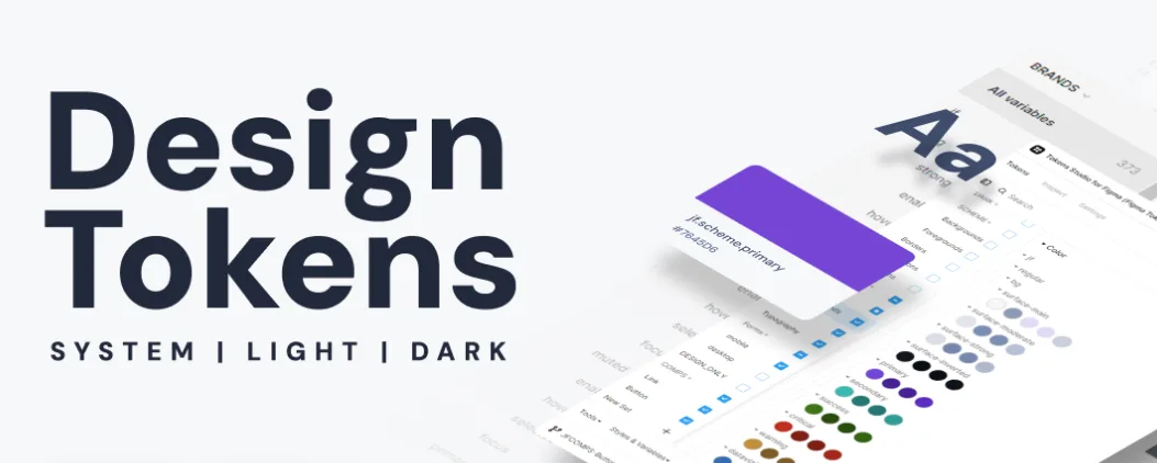
2. Semantic design tokens instead of raw colors
This is what makes brand changes a one-line edit. I never write bg-blue-600 in a
component. I write intent:
<!-- Never this -->
<button class="bg-blue-600">Save</button>

<!-- Always this -->
<button class="bg-primary text-primary-foreground">Save</button>primary, destructive, accent, background,
and foreground are semantic tokens. My brand color (#0072b1) is defined
in exactly one place. When branding changes, I update the token — not three hundred components.
The same discipline covers spacing, typography, border radius, and shadows.
3. Dark mode is built into the token, not bolted on
Because the tokens are semantic, dark mode is a single class-based variant rather than a
per-component afterthought. I define it once with Tailwind v4's @custom-variant:
@custom-variant dark (&:where(.dark, .dark *));Every surface built from ui-shared gets a correct dark variant for free — no
screen is accidentally light-only, because no screen defines its own colors.
4. Accessibility lives in the primitive, so it's solved everywhere at once
Remember problem #5 — the 40-buttons-40-fixes trap? A design system inverts it. Focus states,
reduced-motion handling, and correct semantics live inside the one Button. When I needed
a button to sit inside an anchor without triggering a nested-interactive
accessibility violation, I added one input:
/** Render as `span` when this button lives inside an <a>, so the
 *  anchor stays the single interactive element. Defaults to a real button. */
@Input() as: 'button' | 'span' = 'button';
That fix was written once and now protects every screen. An accessibility improvement to the primitive is an accessibility improvement to the whole app — which is exactly the leverage you never get from 40 copies.
5. The monorepo enforces the boundary
The last piece is structural. In the Nx workspace, ui-shared is a real library
boundary that every feature imports through a path alias —
@botfusion/portfolio/ui-shared, never a deep relative path. The dependency rule runs
one direction: features consume the design system, and the design system depends on nothing above
it. That single constraint is what stops the drift from ever coming back, because there's no
ergonomic way to re-invent a button that's already one import away.
Tailwind + Design Tokens: the multiplier
Tailwind becomes far more powerful the moment you stop scattering raw utility values and route
everything through tokens. Instead of memorizing bg-blue-600 and hoping everyone
picks the same one, the team shares a vocabulary:
bg-primary text-primary border-primaryChange the token once, and buttons, links, alerts, badges, and navigation all update together. The same applies to spacing, typography, radius, shadows, and breakpoints. Tailwind gives you speed; tokens give that speed consistency.
A Real-World Scenario
Picture a more mature startup: 8 frontend developers, 3 designers, 150 screens, 20 releases a month.
| Without a design system | With a design system | |
|---|---|---|
| New screens | Every sprint adds new UI variations | Assembled from reusable building blocks |
| QA | Burns time reporting visual drift | Visual regressions are rare and central |
| Designers | Repeatedly request fixes | Share one language with engineering |
| Brand change | Days of hand-editing | One token, one place |
| Accessibility | Fixed per component | Fixed once, benefits every screen |
| New hires | Struggle to find the "right" version | Productive fast — one obvious primitive |
The result isn't just cleaner code. It's a faster team.
When Should a Startup Actually Start?
Most startups don't avoid a design system out of ignorance. They prioritize speed — and early on, that's the correct call. The real skill is recognizing the moment to shift from "build anything that works" to "build things that can be reused."
In my experience, that moment arrives when you notice the second or third copy of the same component being written. You don't need a 200-component library or a Storybook the size of a product. You need the handful of primitives you actually reuse — Button, Input, Card, Modal, Badge — plus a token layer for color, spacing, and typography. Start there. Grow it only when a real second use case appears.
Final Thoughts
A design system isn't about slowing development with rules. It's the opposite — it removes repetitive decisions so developers can focus on business problems instead of re-building buttons, forms, and layouts for the hundredth time.
The earlier a team invests in reusable components, design tokens, and shared UI standards, the easier it is to scale the product, onboard engineers, and keep a consistent experience as the company grows. I've paid the tax of not having one, and I've felt the leverage of finally building one. The difference is enormous.
In the long run, a design system isn't a luxury — it's one of the highest-return investments a frontend team can make.
Key Takeaways
- The cost of no design system isn't visible on day one; it compounds into slow features, visual bugs, and lost designer trust.
- The framework (React, Angular, Next.js, Tailwind) is never the cause — missing shared standards are.
- Collapse "a component per screen" into one component with typed variants.
- Use semantic design tokens (
bg-primary, notbg-blue-600) so brand changes are one-line edits. - Build dark mode and accessibility into the primitive so they're solved everywhere at once.
- Enforce the boundary structurally (a shared library + a one-direction dependency rule) so drift can't return.
If you are about to add the person who will own this layer, the standards above are also what to interview for — I wrote up what that looks like from the candidate's side in how to hire a senior frontend developer.
References
- shadcn/ui — the copy-in component philosophy this design system is modeled on
- Tailwind CSS: Theme & Design Tokens — defining a token layer
- The Agent–User Interaction (AG-UI) Protocol
- WAI-ARIA Authoring Practices — the accessibility patterns primitives should bake in
I'm Sujit Yadav, a senior frontend developer working across Angular, React, and Next.js — see the work I've shipped or get in touch about a project.